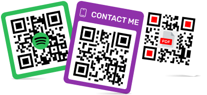
Creative Ways to Color and Style Augmented Reality QR Codes
To create a QR code for a link, video or picture - click on the button below.

Article Plan
- Why Styling Matters for AR QR Codes
- Color Combination Best Practices
- Styling Techniques Table
- Design Approaches by Industry
- Logo Integration Rules
- Color Psychology for AR QR Codes
- Advanced Styling Without Compromising Scans
- Testing Styled QR Codes
-
Frequently Asked Questions about Ways to Color and Style Augmented Reality QR Codes
- Can I use multiple colors in the QR code pattern?
- What contrast ratio should I maintain?
- Can I rotate or tilt a QR code in design?
- How do I know if my styled code is scannable?
- Should I use gradient backgrounds for QR codes?
- Can I add text near styled QR codes?
- What error correction level for minimal styling?
Why Styling Matters for AR QR Codes
Generic black-and-white QR codes lack brand personality. Styled QR codes increase engagement, build trust, and encourage scans—but poor execution destroys scannability. The challenge: maintain visual appeal while preserving functionality. Understanding contrast ratios, error correction, and device limitations separates successful branded codes from failed experiments.
Color Combination Best Practices
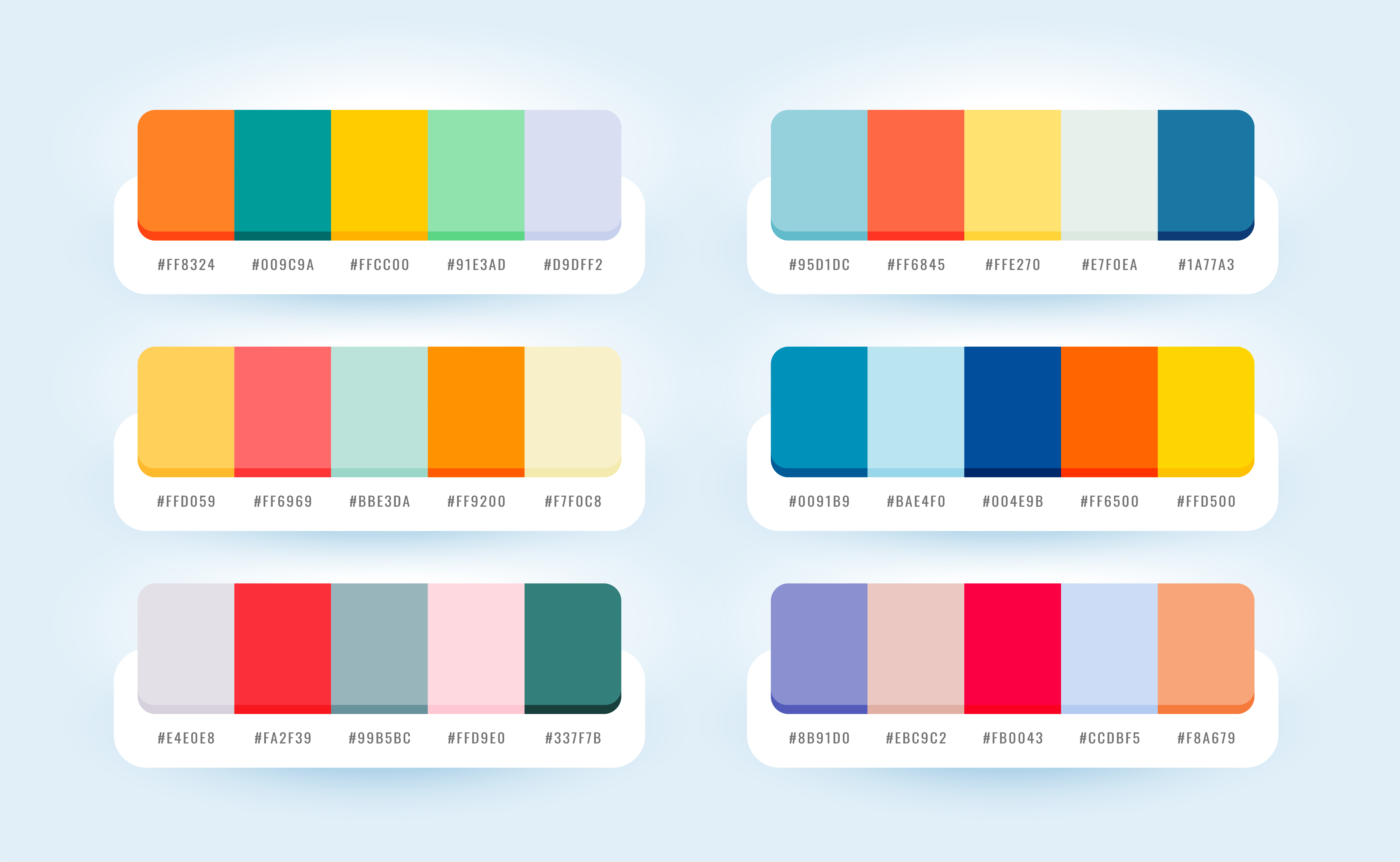
High-Contrast Winners:
- Dark navy on white
- Black on cream
- Dark teal on light gray
- Dark purple on pale yellow
- Dark green on off-white
Minimum Requirement: 3:1 contrast ratio. Test on multiple screens before deployment—screen brightness affects perceived contrast.
Critical Rule: Dark foreground on light background always. Inverted designs (light on dark) fail on most smartphone cameras.
Styling Techniques Table
| Technique | Pros | Cons | Error Level Needed | Logo Size Limit |
|
Solid Color Codes
|
Simple, reliable, strong contrast |
Generic appearance
|
L or M
|
None needed
|
|
Gradient Frames
|
Brand integration, visual appeal
|
Adds complexity if overdone
|
M or Q
|
N/A (frame only)
|
|
Corner Branding |
Subtle customization, minimal interference
|
Limited design space
|
M
|
N/A
|
|
Center Logos
|
Clear brand presence, professional
|
Risk of scan failure if oversized
|
Q or H
|
Max 30%
|
|
Border Frames with CTA
|
Educates users, increases scans
|
Requires proper quiet zone management
|
M or Q
|
N/A
|
|
Patterned Modules
|
Unique aesthetic, artistic
|
Significantly reduces reliability
|
H only
|
Use sparingly
|
Design Approaches by Industry
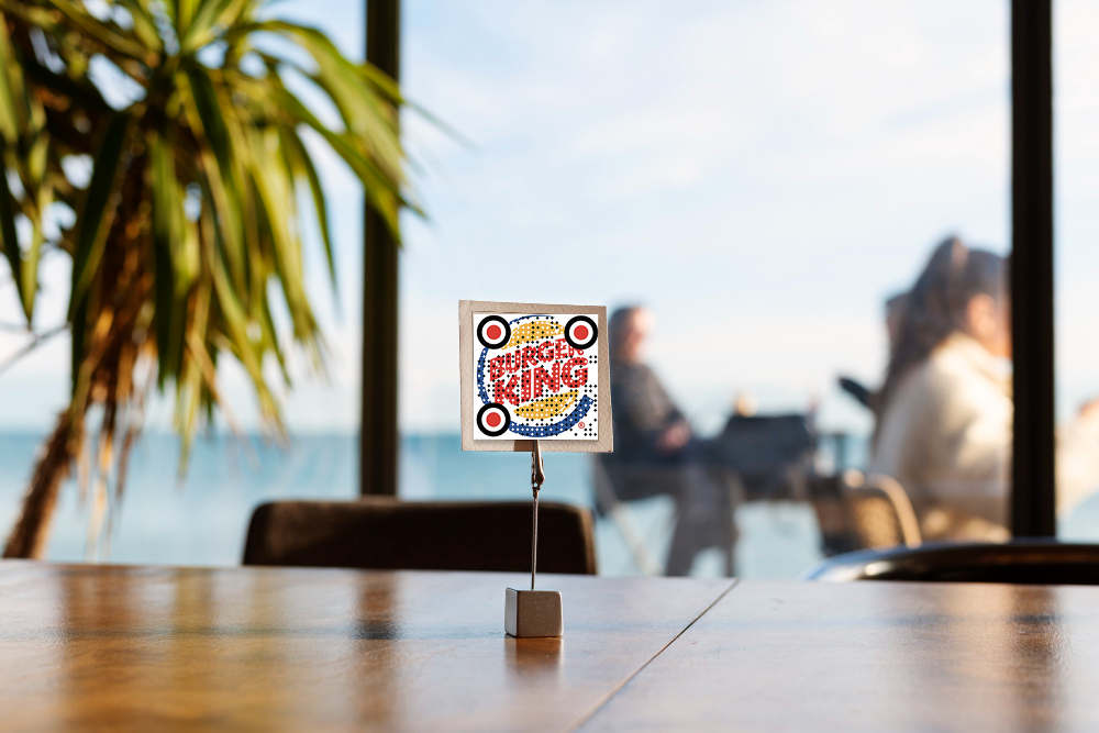
Retail & E-commerce: Simple dark codes on product packaging with subtle brand colors in frame. Minimal logo integration. Error level Q.
Events & Activations: Vibrant colors matching event branding; frames with event name/date. Center logo acceptable with H-level correction.
Tech/Startups: Monochrome with brand accent color in corners. Minimalist frames. Logos in clean geometric shapes.
Hospitality: Elegant gradients in frame only (never in code itself). Sophisticated color palettes. Professional logo placement.
Manufacturing: High contrast (black/white). Minimal styling. Readability prioritized over aesthetics.
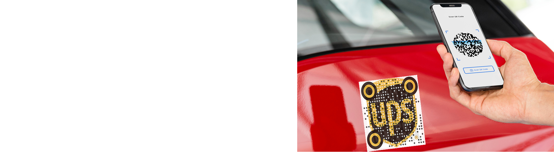
Logo Integration Rules
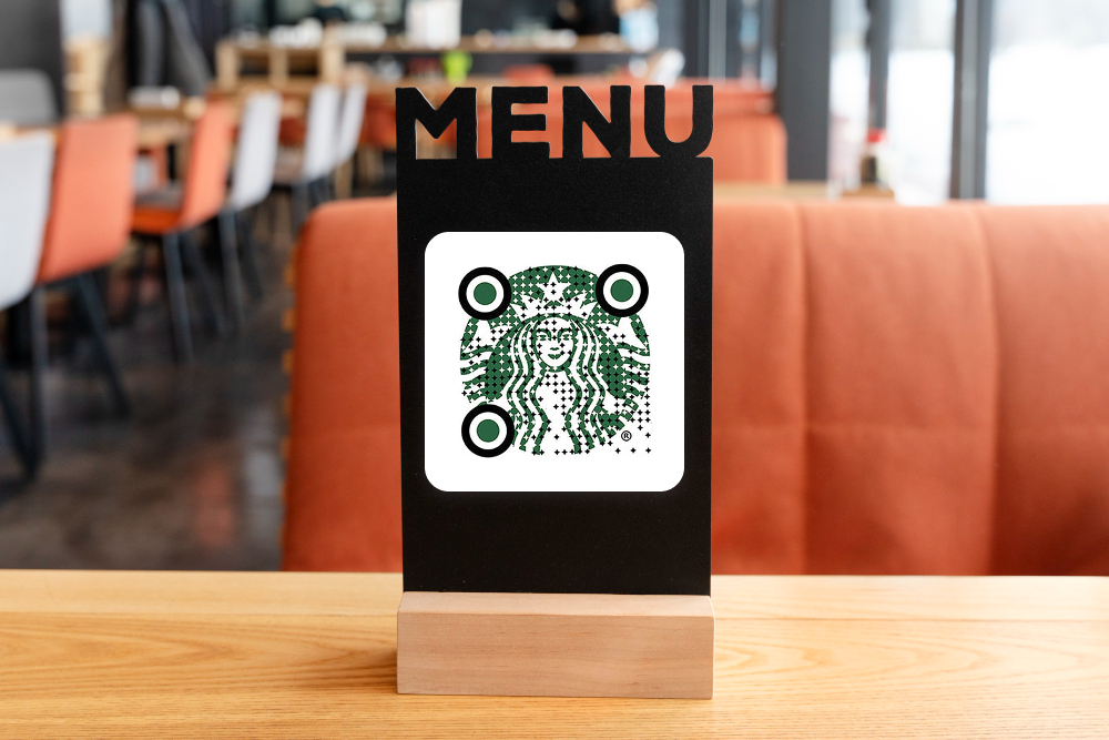
Center Placement Only: Position logos dead center. Any offset risks scanning failure.
Size Limits:
- Q-level correction: ≤15% coverage
- H-level correction: ≤30% coverage
- Never exceed these limits regardless of error level
Background: Solid white or light background behind logo. Never place logo directly on code modules.
Shape: Circular or square logos work best. Avoid intricate details; simple, recognizable shapes scan reliably.
Color Psychology for AR QR Codes
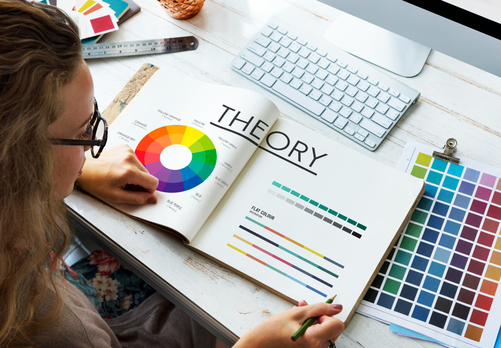
Blue: Trust, technology, reliability—effective for finance, tech, professional services.
Green: Growth, sustainability, health—ideal for eco-friendly, wellness, agricultural brands.
Red: Urgency, energy, action—works for time-sensitive campaigns, promotions, entertainment.
Purple: Creativity, luxury, premium—suits beauty, fashion, premium experiences.
Orange: Friendly, approachable, energetic—effective for retail, hospitality, consumer goods.
Gray/Neutral: Professional, trustworthy—safe choice for B2B, corporate, conservative brands.
Advanced Styling Without Compromising Scans
Rounded Corners: Slightly rounded module corners add elegance. Reduce radius by 20% to maintain scannability.
Gradient Frames (Not Code): Apply gradients only to quiet zone frames, never to the code itself. Keeps design modern without reducing contrast.
Split-Color Backgrounds: Use two colors in frame (50/50 split) matching brand palette. Keeps code area clean and high-contrast.
Stylized Corner Patterns: Replace standard corner squares with brand-aligned designs while maintaining white/dark contrast. Requires H-level correction.
Animated Overlays (Digital Only): For digital displays, add subtle animations around codes (pulsing frames, breathing effects). Never animate the code itself.
Testing Styled QR Codes
Before Deployment:
- Scan on minimum 5 phone models (iOS older/newer, Android models)
- Test from minimum and maximum intended distances
- Verify in poor lighting (dim rooms, outdoors in sun)
- Test at 45-degree angles
- Have non-technical users test
Success Criteria: 95%+ scan success rate across all devices and conditions.
Failure Response: If any test fails, increase error correction level (L→M→Q→H) or simplify design (remove logo, adjust colors).
Frequently Asked Questions about Ways to Color and Style Augmented Reality QR Codes
Minimum 3:1. Higher is better (5:1+ is ideal). Test on multiple screens—brightness affects perceived contrast significantly.
Minor rotations (5–10 degrees) work with H-level correction. Major rotations cause scanning failures. Keep codes straight and upright when possible.
Test extensively. If it fails on any device/distance/lighting combination, increase error correction or simplify design. When in doubt, remove styling elements.
Q-level (25% tolerance) handles most branded designs. Use H-level (30% tolerance) for complex logos or multiple color elements.